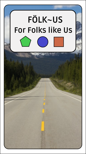
Fölk~Üs
For Folks Like Us
The Immersion Curriculum for my UX Design course with Career Foundry gave several project briefs to build a Responsive Web App off of.
I felt that the Health App brief offered the most interesting options for my learning process, so I set about to develop something within those parameters.
The brief specified that we would be designing:
• An onboarding page (a screen or screens that show(s) the user the basics of getting started)
• A way to sign up and log in that lets users input and save their personal information
• A home screen or dashboard where users can access their information
• A menu that allows users to navigate the application
• A feature that allows users to store and log their medical and health information
• An education and training feature that supports the users in learning more about health and wellness
Project Brief
Summary:
My version of the Responsive Web App project - eventually titled "Fölk~Üs" - centers on issues related to ADHD, Neurodivergent Thought Processes and Executive Dysfunction. It is meant to facilitate health-conscious neurodivergent individuals in recording their health and medical information, as well as aggregate many common productivity tools and other resources vital to managing and improving their productivity in a neurodivergent friendly manner.
Ultimately the project worked as a vehicle for learning UX Design Principlesing the full UX Design Process in a hands-on manner.
Target Audience
The Target Audience for the app is 18–40-year-olds seeking to manage and monitor their symptoms, medications and other elements that contribute to sustainable mental health and executive function habits. The emphasis is on the population that may not have other resources at their disposal like school counselors or job coaches.
Competition
Health and Wellness apps are abundant and new ones that focus on Mental Health and ADHD are entering the fray all the time. Primary competitors are: “Better Help,” “Cerebral,” “Done,” and “Talk Space.” Which focus on finding therapy and tracking goals and progress with them. Other peripheral apps that relate to the challenges of ADHD and executive dysfunction and which are often talked of in those circles are “Headspace” (Meditation, Focus and Mood Management), “Evernote” (task tracking and planning), and “ToDoist” (task tracking and planning).
Risk/ Opportunity
The main risk is simply being overlooked or bypassed in favor of an established app already on the market. There is also risk in providing non-helpful tools or features that could contribute to problems rather than alleviate them.
The big opportunity is in the integration and marriage of multiple apps to create a one stop hub for therapy, medication, and symptom tracking. goal planning, meditation, and community support, among other things. There are not currently any apps that address clinical and behavioral factors of managing ADHD.
Conclusions
We can offer an integrated experience that allows adults with ADHD to see and plan every aspect of their treatment with tools for finding and forming better habits for themselves.
User Research
Though I chose this brief because I have my own stake in the subject matter and community (Neurodivergentt Indviduals) it was important, as with any project, to find a larger relevant user base to interview.
I recruited users from the existing ADHD communities that I am already affiliated with, and the interviews were used to confirm and expand my own thoughts on the function of the app as well as find fresh insights from others on what features could be beneficial.
The data collected went towards not only building app features, but also to envision different User Personas that would inform journeys, flows and the overall app experience.
Abbreviated Questionairre:
1. Which of the following tools for managing your ADHD do you think could be useful as an app?
•Accepting Diagnosis
•Self Care
•Sleep Management
•Medication Tracking
•Impulse Control
•Finding Acceptible Stimuli
•To Do Lists
•Time Management/ Planning
•Reducing Clutter
•Meal Planning
•Finding Support
•Accepting Diagnosis
•Self Care
•Sleep Management
•Medication Tracking
•Impulse Control
•Finding Acceptible Stimuli
•To Do Lists
•Time Management/ Planning
•Reducing Clutter
•Meal Planning
•Finding Support
2. Describe your favorite app that helps you with your ADHD
3. Describe your favorite app or or game overall unrelated to ADHD coping
4. Which tools/methods work best for you?
5. Which tools or methods are most important for you?
6. What tools or methods are not currently addressed by any technological tools that you know of?
Functional Requirements:
It was already in the project brief that the app would feature:
• An onboarding page
• A log-in page
• A dashboard
• A navigation menu
• A medical and health information storage feature
• An education and training feature
• A log-in page
• A dashboard
• A navigation menu
• A medical and health information storage feature
• An education and training feature
However, after processing the interviews with potential users and analyzing the competition from other adjacent/relevant apps, the following additions to the list of requirements was determined.
•Personal Productivity Tools
•Community Chat Feature with Peers and/or Professionals
Card Sorting
A Card Sort is an excellent study tool for developing an Information Architecture Framework. It helps to determine the associations different users have with different features. This kind of data is essential for grouping features in the most logical manner for the users.
A digital card sort was conducted using the Optimal Sort website. Features/Functions and Categories were presented and people were asked to sort them according to their personal associations.
Survey Setup
Type:
•Hybrid Card Sort
•Hybrid Card Sort
Participants (13 - Total)
• 7 - Complete
• 2 - Abandoned But Usable
• 4 - Abandoned & UnUsable
• 7 - Complete
• 2 - Abandoned But Usable
• 4 - Abandoned & UnUsable
Tool:
Optimalsort (website)
Optimalsort (website)
Categories (3+)
•Self-Help
•Profession Help
•Peer Help
•User Defined
•Self-Help
•Profession Help
•Peer Help
•User Defined
Cards/Topics (18)
•Account Info
•Activity Log
•Alarms
•Articles
•Chat Rooms
•Find a Doctor/Therapist
•Friends List
•Goals
•Help With Site/App
•Make and Appointment
•Message Board
•Prescription Help
•Reminders
•Saved Articles
•Self-Assessments
•Support Events
•Timers
•To-Do Lists
•Activity Log
•Alarms
•Articles
•Chat Rooms
•Find a Doctor/Therapist
•Friends List
•Goals
•Help With Site/App
•Make and Appointment
•Message Board
•Prescription Help
•Reminders
•Saved Articles
•Self-Assessments
•Support Events
•Timers
•To-Do Lists
Goal
Gain Insight on IA especially for the structure of admin tasks.
Sorting Screen
Upon receiving the welcome and instructions outlined above, each user started with this screen (to the right) and began sorting topics as they saw fit.
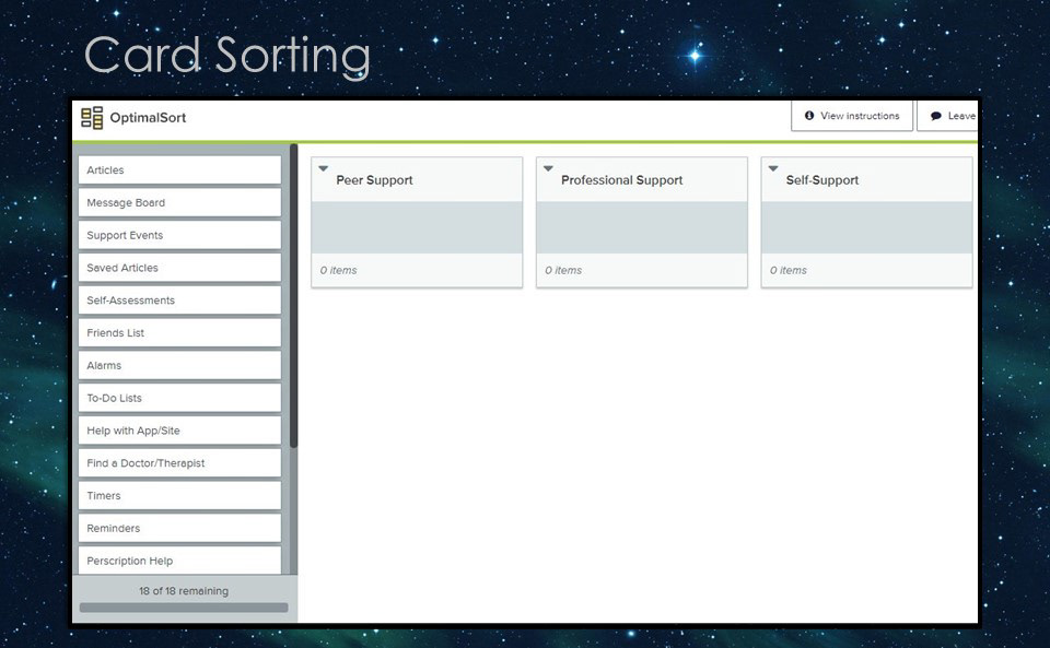
Screenshot of Sorting Screen
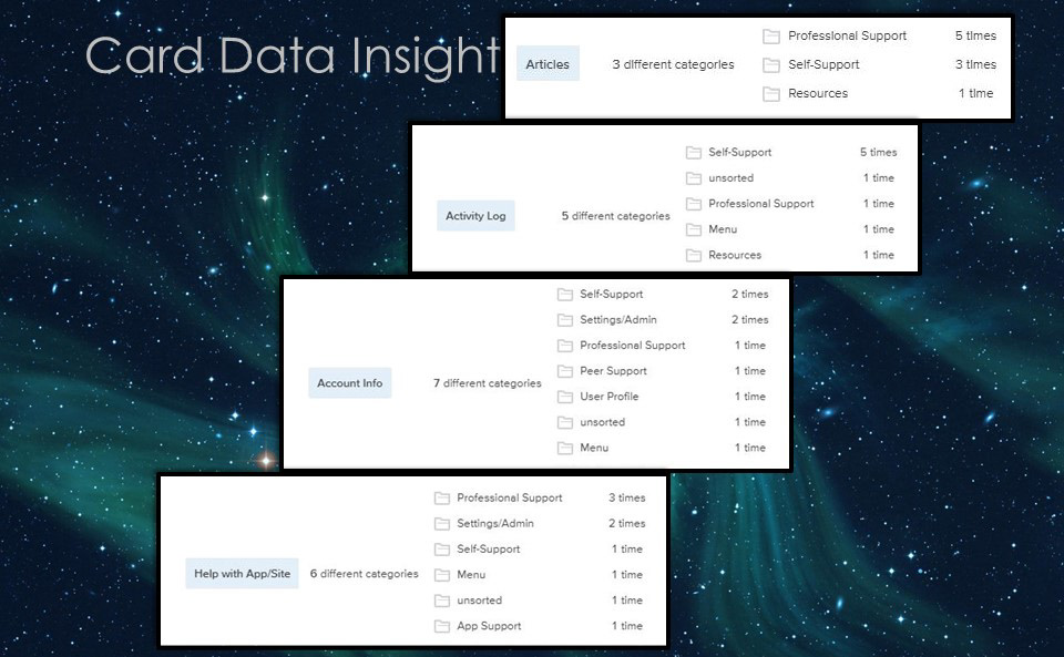
Card Data Insight
For the most part, the features listed were categorized as expected, the only noticeable exceptions being:
•Account Info
•Activity Log
•Help with App/Site
•Articles
•Account Info
•Activity Log
•Help with App/Site
•Articles
Many people categorized “Articles” under “Professional Help” whereas I was leaning toward placing them under “Self-Help.”
For the other 3 cards, they were placed in a larger variety of categories, but most of them essentially fell into the user-added category of “Settings/Admin “
The Key insight that was taken away from this phase of research and testing was the need to alter my site map to include a more intuitive flow that coincides with the user expectations gathered from the card sort.
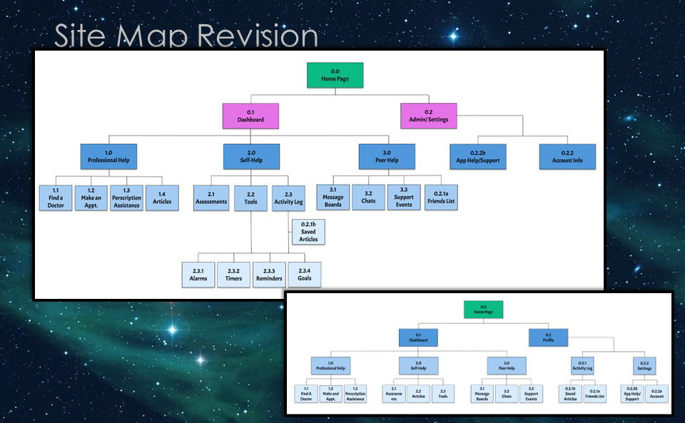
Site Map Revision
The top image is the Preliminary Site Map
The bottom image is the Revised Site Map
As you can see, my findings led me to create a space between the "Home"/ Landing page and the major features of the experience, where the user could detour into admin settings before accessing the main "fun" features.
Another change was to re-locate some of the "Profile" features into the "Self Help" section which was broken into more levels.
The "Admin" experience was then broken into "App Help/Support" and "Account Info" in order to keep personal info like name and other PII, separate from app specific settings and preferences.
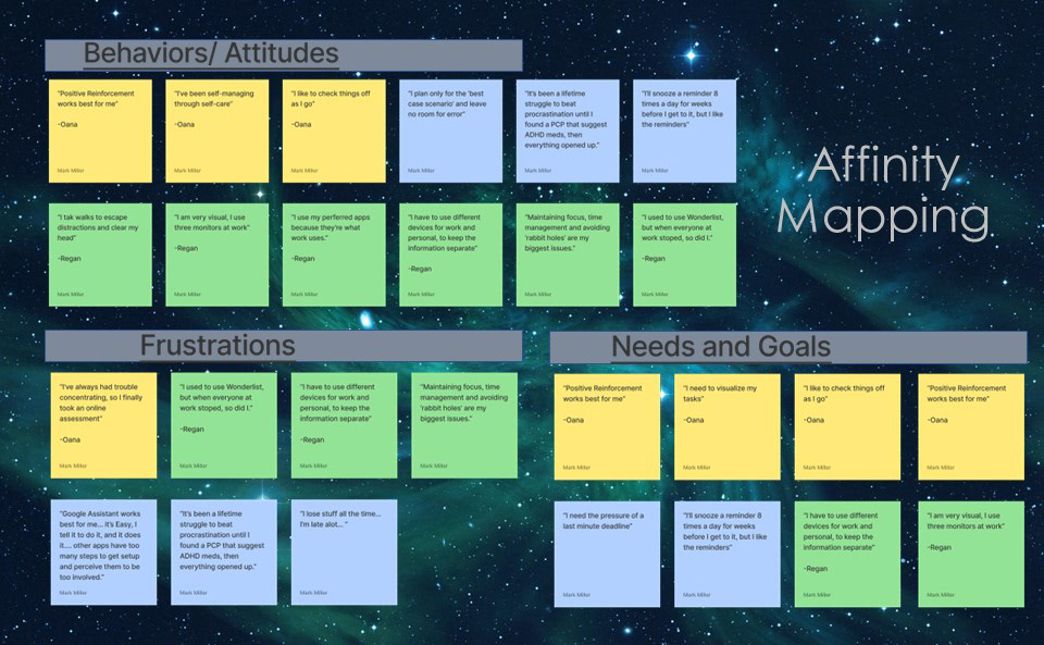
Affinity Mapping
While ADHD manifests and affects people in different ways and is often dealt with in just as many, Several Themes Arose.
The insights gathered from user interviews were color coded by who gave the insight and then grouped by what seemed to be related to Behaviors, Frustrations and Needs/Goals
Themes and concepts that arose were:
•Concentration Issues
•Time Management
•Visual Processing
•Positive Reinforcement
•Simplicity
•Flexibility
•Time Management
•Visual Processing
•Positive Reinforcement
•Simplicity
•Flexibility
All of these findings were taken into account for the next phase of develpoment...
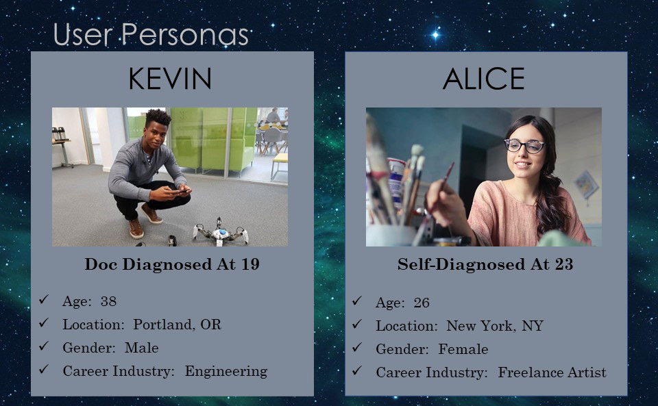
But first, a few User Personas were created.
User Personas
Based on the potential user interviews I conducted along with personal experience from support groups and other resource communities, I designated 2 Personas to bear in mind while designing this app experience.
The first Persona is named "Alice"...
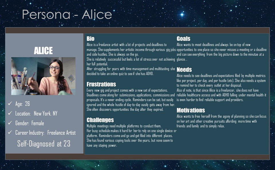
Persona - Alice:
Alice is a young artist/entrepreneur learning to self-regulate and manage her time and commitments without an official diagnosis or medication.
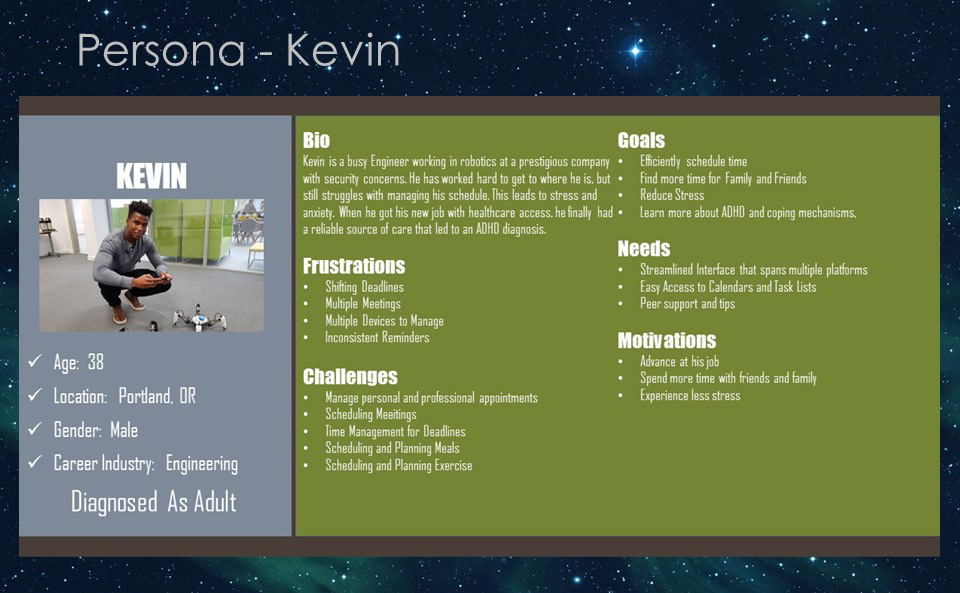
Persona - Kevin:
Kevin is a young professional who was diagnosed as an adult and is now looking to manage his time and commitments as well as doctors appointments and perscriptions
Journeys
Two Types of User Journey were imagined...
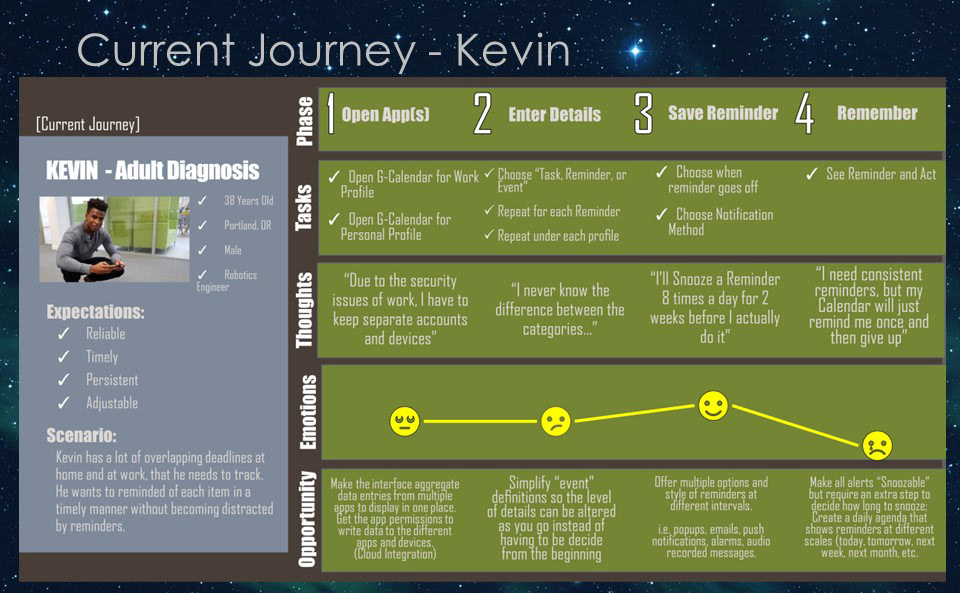
The 1st User Journey was to show the Current Journey of a user like Kevin.
He has a busy work/life balance and needs to be able to function at peak efficiency, so that work time is filled with work and family time can be spent with family, without any distractions or overlap.
We can see in this current journey that Kevin is overwhlemed by the multiple apps he must use to stay organized at work and for personal matters and finds that the options and categories for many productivity apps he already uses are insufficient.
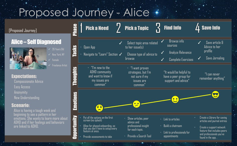
The 2nd User Journey was imagined to show the path that a user like Alice would want to have using our app.
She will have a more consistent journey of satisfaction as she progresses through familiarizing herself with our app.
The features of our app will give her community to feel supported by and the needed tools to add structure to her day-to-day life.
This persona also used an alternative story telling method of bullets in the opportunity section, as opposed to paragraphs.
Bulleted lists are often quicker and easier to absorb and process.
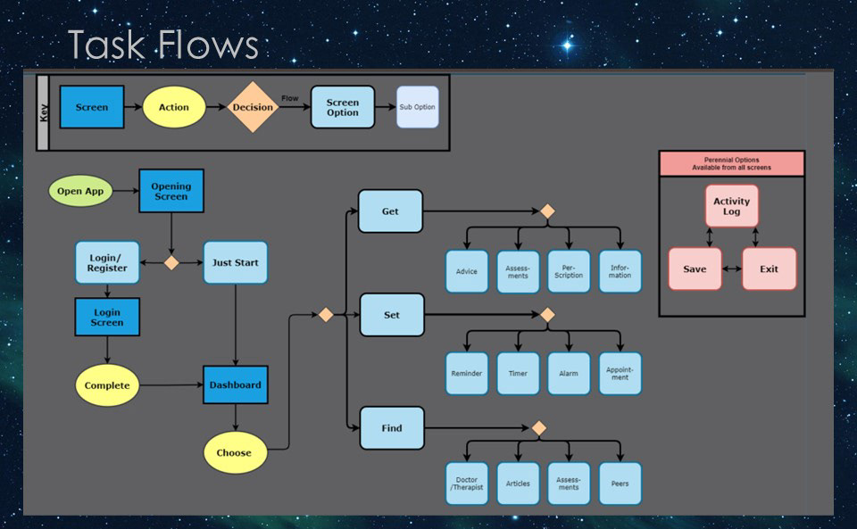
Task Flows
Basic App Flow
The basic flow of the app should allow for multiple paths to get to all screens and experiences in order to accommodate the varied divergent thought processes of the the target user groups.
Some may impulsively click through while others are more meticulous and measured.
The experience should be flexible with checks and balances to assure nothing is accidentally over looked.
The flow shown here is largely focused on the main functions of the app and our desire to provide more than one way to get to any given resource.
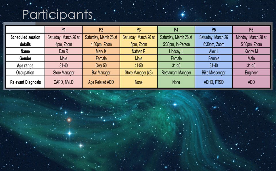
User Testing
Results
Once an Mid-Fidelity Prototype was created,6 User tests were conducted between March 26 and 28. All but one, were completed remotely. Of the remote sessions, all but one were conducted via Zoom for Desktop and one via Zoom on a mobile device. All tests used the “Mobile Resolution” of the app. Due to technical issues, non-verbals of users were not able to be collected for remote tests, however a screen capture of their app interactions was recorded.
For each tester, I read the full script to them step by step. But also pasted the text into the chat window for them to refer back to. Once I read off the task scenarios, I tried to stay out of the way and not give any extra information unless I felt it necessary.
Agenda:
5 Remote Testers
4 via Zoom for Desktop
1 via Zoom for Mobile
1 In-Person Tester
5 Remote Testers
4 via Zoom for Desktop
1 via Zoom for Mobile
1 In-Person Tester
Tasks/Features to be Tested:
Sign-Up and Complete Onboarding
Set a Basic Timer
Add a Comment in the Forum
Review and Edit Activity Log
Sign-Up and Complete Onboarding
Set a Basic Timer
Add a Comment in the Forum
Review and Edit Activity Log
Demographics Collected:
Age Range: (18-20, 21-30, 31- 40, 41-50, Over 50)
Occupation:
Neurodivergent Diagnosis (if any): (ADD, ADHD, Other)
Age Range: (18-20, 21-30, 31- 40, 41-50, Over 50)
Occupation:
Neurodivergent Diagnosis (if any): (ADD, ADHD, Other)
Background Questions:
Do you receive any treatment?
Do you use any web or mobile tools for your condition?
Do you use any non-ADHD specific apps?
Are there any apps or programs you have tried & abandoned, and why?
How do you find strategies for managing your condition?
Do you receive any treatment?
Do you use any web or mobile tools for your condition?
Do you use any non-ADHD specific apps?
Are there any apps or programs you have tried & abandoned, and why?
How do you find strategies for managing your condition?
Open Ended Questions
What Jumps out at you?
Does it look interesting or like something that would be of help to you?
What would you expect to find under each section?
What Jumps out at you?
Does it look interesting or like something that would be of help to you?
What would you expect to find under each section?
Follow-Up Questions: (adapted from NASA-TLX)
On a scale of 1-10:
On a scale of 1-10:
How demanding would this app be for you mentally?
How demanding of your time would this app be?
How successful do you think you were in achieving the requested tasks?
How much effort would you need to put into the app for it to be useful?
How frustrated were you during the trial of this application?
How demanding of your time would this app be?
How successful do you think you were in achieving the requested tasks?
How much effort would you need to put into the app for it to be useful?
How frustrated were you during the trial of this application?
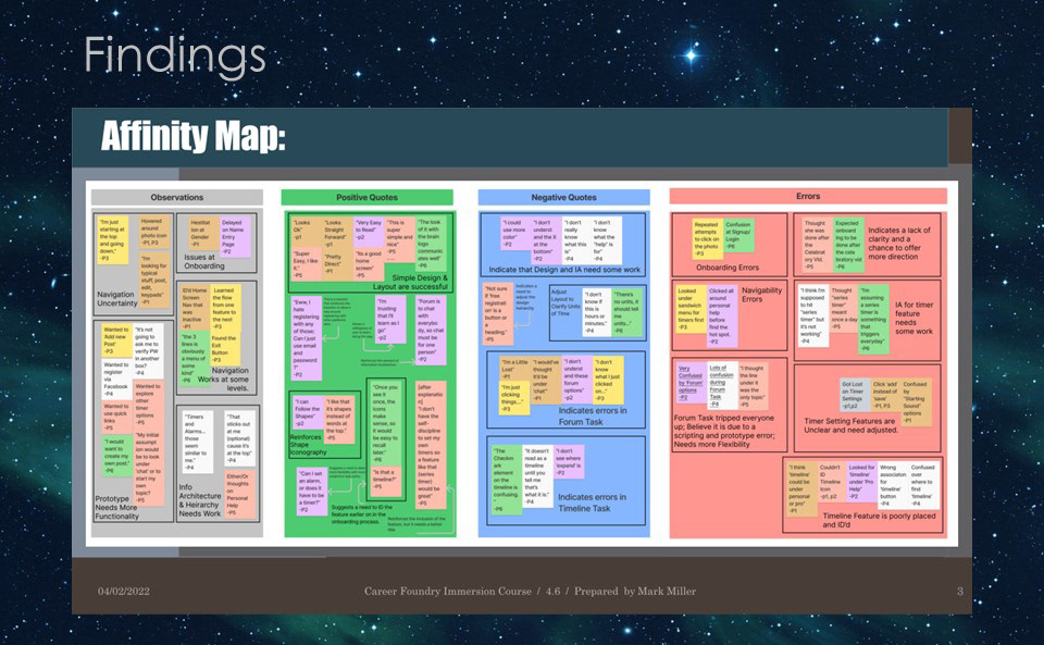
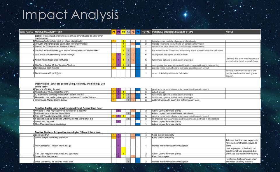
Analysis
Overall Impact
The Big Discoveries that came out of the first round of User Testing were related to clarity and completeness.
Users couldn't find the timer tool and seemed to be looking for more functionality in the prototype than I'd provided. When the user did find the timer, there was confusion over units on the timer.
Other issues were due to unclear visual organization.
The remedies for these issues were fairly simple as they were essentially "Beginner Mistakes"
I restructured several problem screens and flows and included more detail "feature tours" in the onboarding and sign-up process.
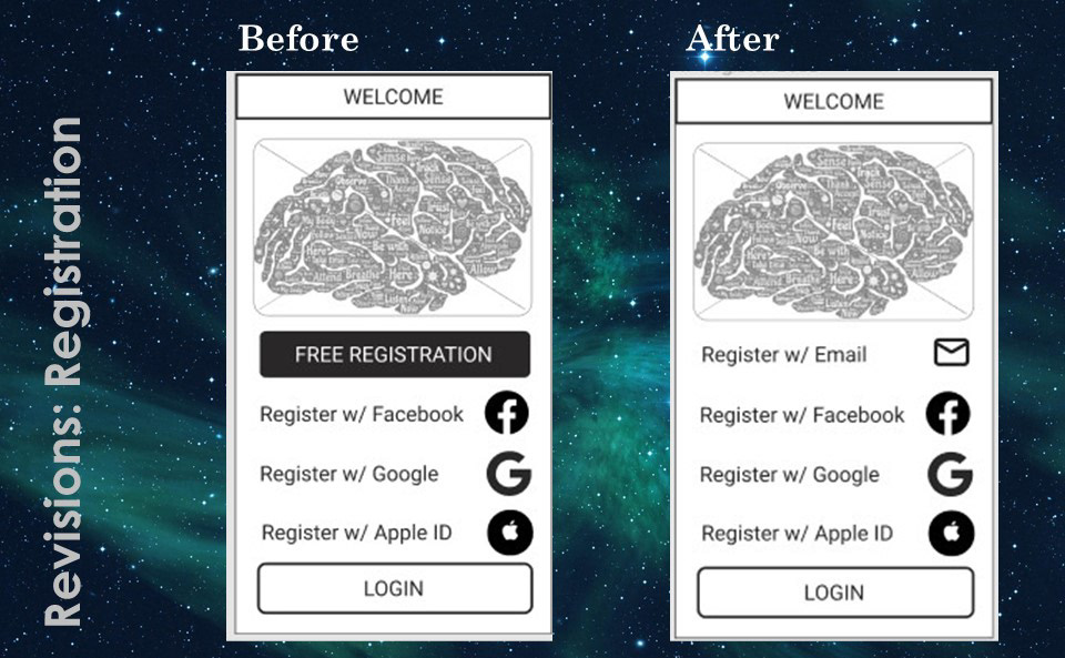
Wireframe Revisions:
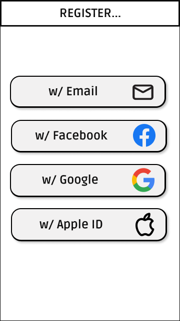
Registration
The issue over registration options confusion was alleviated by standardizing the appearance of all the buttons. The look of the buttons would change in later iterations, but the buttons will remain uniform in appearance to reduce confusion.
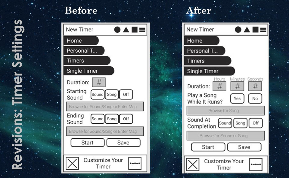
Timer Settings
This was a fairly simple fix as well. I added two more fields and labeled them by the units they represent.
This feature will also evolve in future iterations, but the essence is maintained.
Prototyping
In the final iteration of my app, I utilized several visual design conventions to craft a dynamic experience. When you explore the clickable prototype on your own, you'll find animations and click-throughs to showcase the experiences I was trying to perfect.
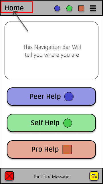
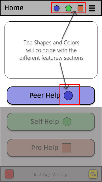
Color was added to work in conjunction with the shapes for feature identification that is immune to color-blindedness.
The triangle icon was changed to a pentagon, simply because it was easier to work with in layouts.
The colors for each section were further expanded to help guide users and help them to navigate features.
Several grids were applied to the layouts to facilitate simpler decisions when placing features on the screen.
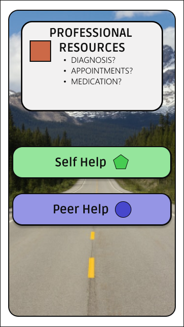
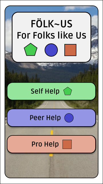
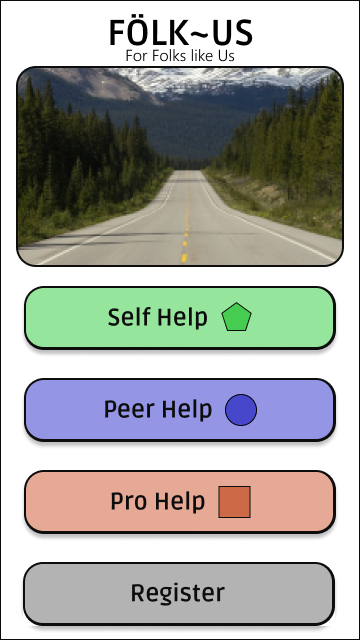
Opening Splash Animation
Here, we see a selection of the screens that are part of the opening splash animation. It is meant to greet the user and show them what tools and features are available as they ease into the new app experience.
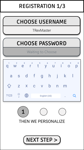
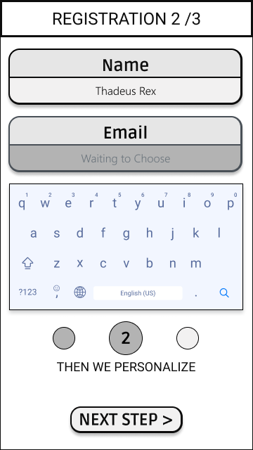
Registration Screens
The registration screens remained fairly simple. Registering on a new app has become fairly common and users almost click through on auto-pilot so there is no need to get too fancy here

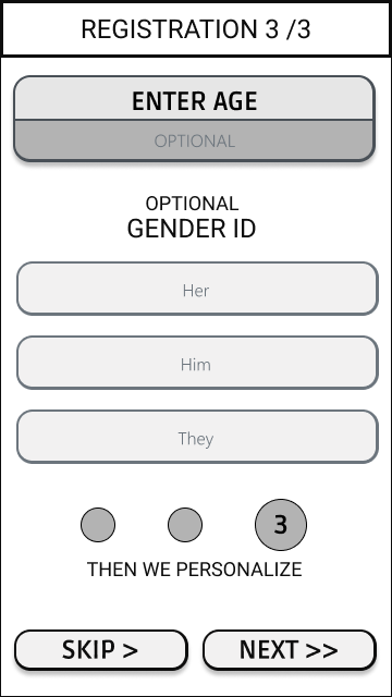
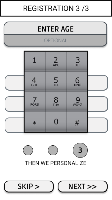
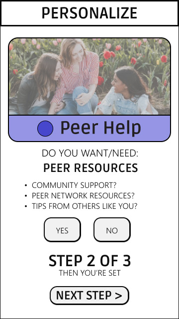
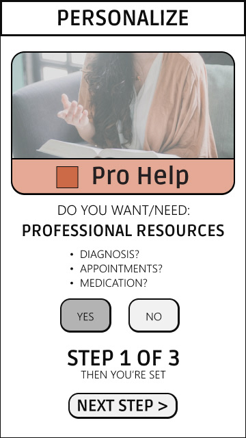
Onboarding
After Registration, it's time to Personalize the features of the app.
At this point a user can choose which tools they want access to. I find this to be an important feature, since many ADHD individuals are easily overwhelmed by choices and options, so I hope that allowing them to ease in with just a few tools at their disposal will improve satisfaction and retention.

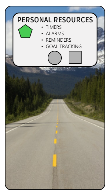
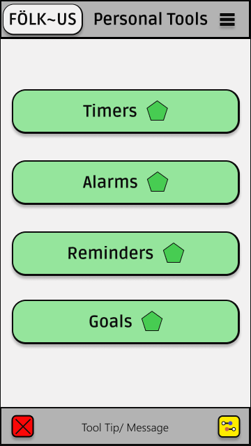
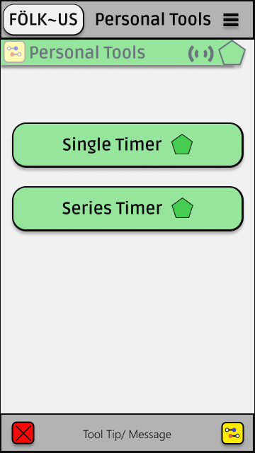
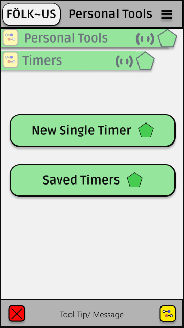
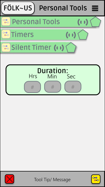
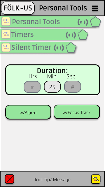
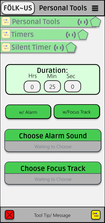
Personal Tools
The personal tools features ended up being a big area of concentration.
The web iteration became informative in ideating a simpler interface and flow for setting a timer.
A pattern was created that would introduce each editable feature one-at-a-time so the user is not overwhelemed.
As you can see in the screen protoypes, the user picks their timer length and then is given the option of choosing if they want a focus sound and/or an alarm sound before they are asked to choose what that sound will be.
A progressive experience like this, will be easier to digest for users.
A progressive experience like this, will be easier to digest for users.
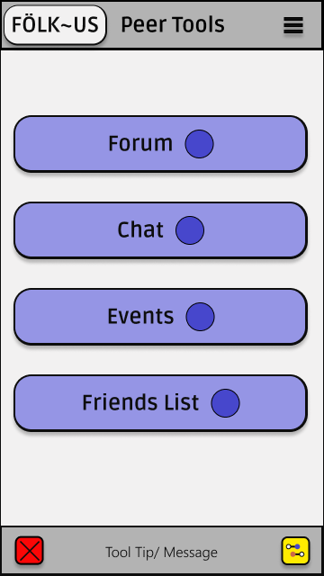
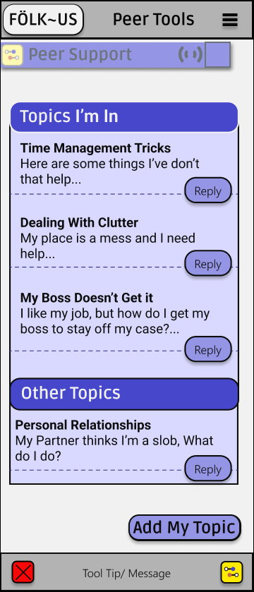
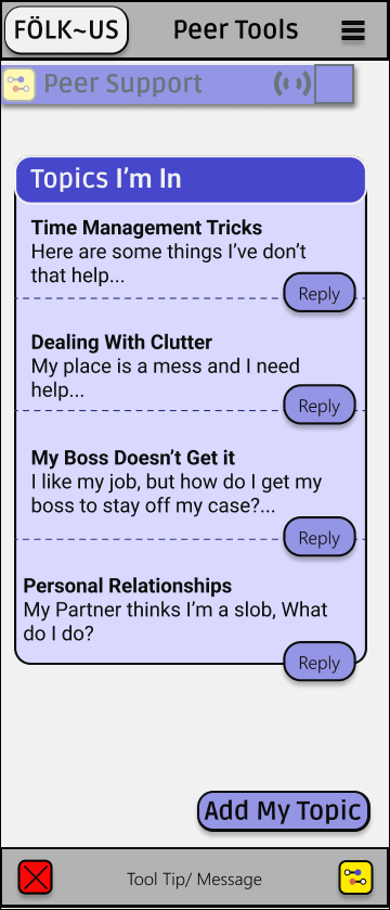
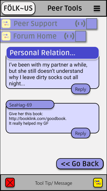
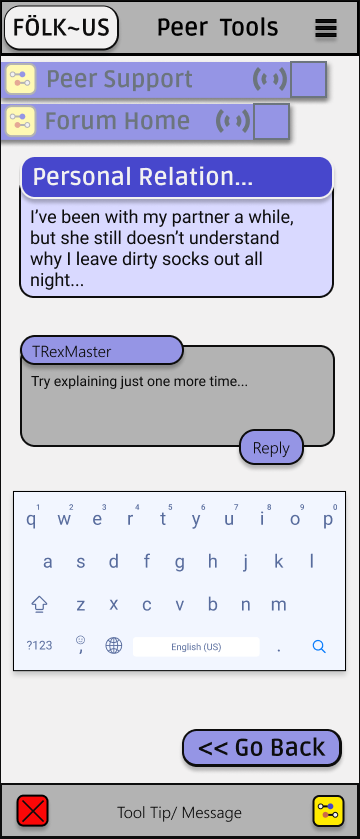
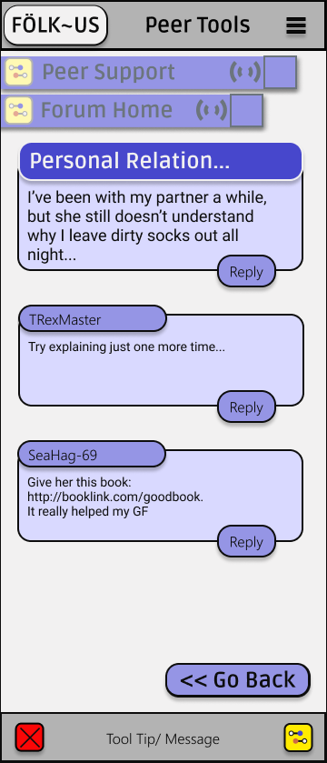
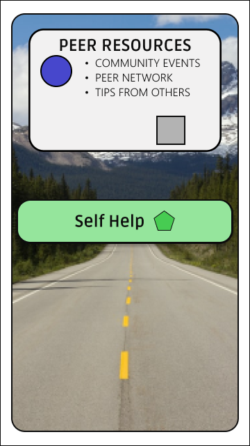
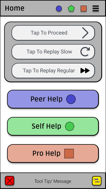
Peer Help Forum
The Peer Help Forum Feature is another important part of my app.
I modeled it after familiar chat apps like Slack and Facebook, but wanted to included a dashboard experience that shows all your active topics while recommending new ones of interest.